Social Media
YouTube’s homepage redesign focuses on usability, giving you control over recommendations

YouTube’s homepage is getting a makeover. The company announced today an updated, cleaner design that does away with information density to instead give more room to the videos and their titles, plus other new features like an “Add to Queue” option on the desktop, a desktop version of YouTube’s stop suggesting feature, and more.
The design changes rolling out today are focused on the desktop and tablet versions of YouTube, not the YouTube mobile website or app, the company says.
Google, as of late, has been doing away with tighter, more compact displays of text and imagery in its products, allowing the content itself to have more room to breathe. For example, the makeover of the Google News in Search spread out news articles into cards, instead of more compressed groupings of headlines. These sorts of changes benefit readability, but they also mean there’s less content visible on the page before you have to scroll down.
The same now goes for YouTube.
In the updated design, there are fewer videos per row as YouTube is allowing for longer video titles and larger video thumbnails, which makes it easier to see what the video is about.
It’s also adding higher resolution previews and is giving more space to the channel icons beneath each video, so you can quickly identify those from your favorite creators.

These changes will impact the homepage’s layout, to some extent.
YouTube says it’s removing some of the content shelves — those areas where it organizes videos by channels and topics. The new homepage will still show some of these same videos, but they won’t be grouped into these shelves anymore. Instead, YouTube’s new design shows videos in shelves like Breaking News and Top News, when it makes sense.
Meanwhile, YouTube is bringing its “Add to queue” option to the desktop. Now, you’ll be able to click on a button on the video thumbnail to either add the video to your Watch Later list, as you can today, or now, to your queue.
You can also do this while still watching a video that’s been minimized to the corner of the page.
Queues are a useful way of quickly building out a playlist on the fly, but they aren’t meant to take the place of a proper playlist — that is, they’re not meant to be saved for later viewing once the queue is complete. YouTube says its desktop queue clears when you close your browser. That means if you want to save videos for viewing across devices, you’ll still want to use the “Watch Later” button as before.

Another new feature is one that’s making the jump from mobile to desktop.
Earlier this year, YouTube had rolled out a series of changes that allowed users to gain more control over what videos were appearing on their homepage and in their Up Next suggestions, which is powered by algorithms. It introduced a “stop suggesting” feature in the form of a button that would allow you to stop being shown videos from a particular channel.
Now that same “Don’t recommend channel” option will be available on the desktop.
You’ll find it on the three-dot menu next to a video on the homepage. Once clicked, that channel’s videos won’t hit your YouTube homepage again. However, this is not a full “block” button — the videos can still come up in search, the Trending tab, or if you visit the channel directly.

Also earlier this year, the YouTube Android app was updated with a new feature that allowed users to select their favorite topics and customize their Home feed with related videos.
This same feature will make its way to desktop and tablets in the near future, but isn’t ready in time for today’s launch.
All the changes today are a big boost for readability and usability, though for some creators they may also be a double-edged sword. On the one hand, creators’ videos are being given more real estate on the homepage and their own branding is larger. But on the other, the decreased homepage density means there are fewer spots available to showcase videos before viewers have to scroll down.
The latter changes focused on allowing users more direct input into what videos are shown to them arrive at a time when YouTube has come under pressure, along with other social media companies, for helping to spread hate speech and disinformation by way of algorithms that continually adapt to display more of people want, no matter how terrible.
To what extent YouTube is culpable is being heavily debated. Contrary to earlier reports, one newer study indicated that it’s not so much the algorithm that radicalizes people, but rather the active communities they find online. But it’s a complex issue. And those who have extricated themselves from dark YouTube rabbit holes point to a variety of factors that led them astray — feeling of isolation, depression, and not knowing one’s place in the world, for example, combined with video recommendations that invite them deeper into ever more extremist online communities.
YouTube’s response has so far been to stand by free speech (at least to some extent), while also giving users more tools to make decisions for themselves — like the changes mentioned above.
This sentiment of “if you don’t like it, just don’t watch it” (now by way of an algorithm-override button) isn’t unique to YouTube. These days, it’s common to see people respond to others who are getting angry on Facebook threads by telling them to “just keep scrolling.” In other words, there’s a growing sense that people will have to take personal responsibility to navigate today’s web, as filled as it is with things that a large majority doesn’t want to see.
YouTube says its updated design will begin rolling out today across desktops and YouTube apps on Android and iOS tablets, and will reach everyone soon.


Xaira, an AI drug discovery startup, launches with a massive $1B, says it’s ‘ready’ to start developing drugs

Rabbit R1 hands-on review: Something is iffy about this

UK probes Amazon and Microsoft over AI partnerships with Mistral, Anthropic, and Inflection

‘Shōgun’ co-creators break down the finale: ‘It’s a story about death’

Tesla’s new growth plan is centered around mysterious cheaper models

Tesla’s in trouble. Is Elon Musk the problem?

Two widow founders launch DayNew, a social platform for people dealing with grief and trauma

Google Pixel 9 and Pixel 9 Pro: Release date, specs, new features, and other rumors

UnitedHealth says Change hackers stole health data on ‘substantial proportion of people in America’

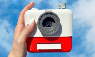
Mood.camera is an iOS app that feels like using a retro analog camera

API startup Noname Security nears $500M deal to sell itself to Akamai

US think tank Heritage Foundation hit by cyberattack

NASA discovered bacteria that wouldn’t die. Now it’s boosting sunscreen.

How to watch ‘Argylle’: When and where is it streaming?

Tesla drops prices, Meta confirms Llama 3 release, and Apple allows emulators in the App Store

Tesla layoffs hit high performers, some departments slashed, sources say

TechCrunch Mobility: Cruise robotaxis return and Ford’s BlueCruise comes under scrutiny

Meta to close Threads in Turkey to comply with injunction prohibiting data-sharing with Instagram

Former top SpaceX exec Tom Ochinero sets up new VC firm, filings reveal

Where’s the AI in these ‘AI-powered’ products for your home?
Xaira, an AI drug discovery startup, launches with a massive $1B, says it’s ‘ready’ to start developing drugs
Rabbit R1 hands-on review: Something is iffy about this
UK probes Amazon and Microsoft over AI partnerships with Mistral, Anthropic, and Inflection
‘Shōgun’ co-creators break down the finale: ‘It’s a story about death’
Tesla’s new growth plan is centered around mysterious cheaper models
Tesla’s in trouble. Is Elon Musk the problem?
Two widow founders launch DayNew, a social platform for people dealing with grief and trauma
Google Pixel 9 and Pixel 9 Pro: Release date, specs, new features, and other rumors
UnitedHealth says Change hackers stole health data on ‘substantial proportion of people in America’
Mood.camera is an iOS app that feels like using a retro analog camera
-

 Business6 days ago
Langdock raises $3M with General Catalyst to help businesses avoid vendor lock-in with LLMs
-

 Entertainment5 days ago
What Robert Durst did: Everything to know ahead of ‘The Jinx: Part 2’
-

 Entertainment5 days ago
This nova is on the verge of exploding. You could see it any day now.
-

 Business5 days ago
India’s election overshadowed by the rise of online misinformation
-
 Business5 days ago
This camera trades pictures for AI poetry
-

 Business5 days ago
CesiumAstro claims former exec spilled trade secrets to upstart competitor AnySignal
-
 Entertainment7 days ago
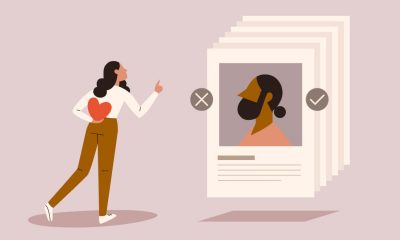
Dating culture has become selfish. How do we fix it?
-

 Business7 days ago
Screen Skinz raises $1.5 million seed to create custom screen protectors