Technology
The CDC’s vaccine data website shows progress — and inequity.
The stats on the CDC’s vaccine data website are cause for both hope, and — for Black and brown communities — sadness-tinged outrage.
The CDC added a vaccine stats section to its COVID data hub at the beginning of January. It includes counts of vaccine doses distributed to states, those administered to people in the states, and a color-coded map based on the percentage of vaccines administered per a state’s 100,000 residents. It also features numbers on the long term care facility vaccine partnership.
Over the past two months, the CDC has made its data more granular. Visitors to the site can now see those numbers of doses distributed and administered for the general population versus the 18+ population. It also shows numbers for people who have had one shot versus two shots, since the Moderna and Pfizer vaccines require two shots, spaced out four and three weeks, respectively. Both shots are required for full vaccination.
In the “vaccine trends” section, which users can reach by expanding the “vaccines” tab in the left hand sidebar, you can view the moving daily average of shots administered per day.
It has been heartening to see vaccine numbers go up and up since the new year. Even with much more progress needed to reach herd immunity, those data points and percentages represent real people protecting themselves and their family members from COVID. As of this writing, over 80 million vaccine doses had been distributed to Americans.
Unfortunately, the outlook is not as sunny if you dive deeper into some of the data.
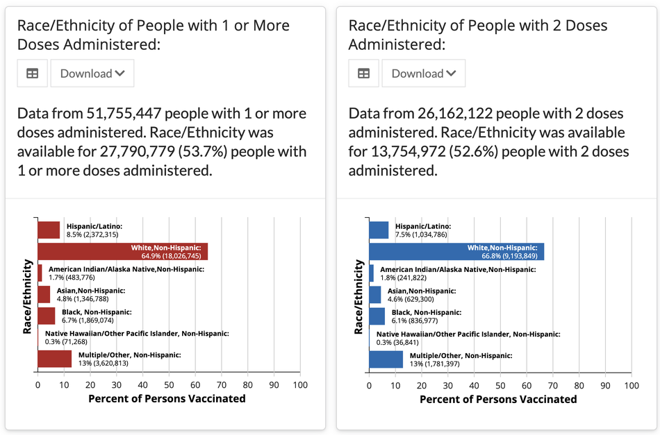
In the sidebar, you can also click on “vaccination demographics.” This allows you to see vaccine breakdowns by age, sex, and race.
The CDC gives a big caveat: “these data are…not generalizable to the entire US population.” That’s because reporting from state to state is inconsistent, and because states are prioritizing different groups differently from each other.
Still, the stats — particularly those around race — support what has been widely reported: That white people are getting the vaccine at far higher rates than people of color. White people comprise around 65 percent of the people who have received both one shot and two shots. In contrast, only 8.5 percent of people who have received one shot are Hispanic and just 6.8 percent are Black. For other ethnicities, it’s even lower. The numbers are similar for recipients of two shots.
Vaccine distribution hasn’t been proportionate demographically, nor has it prioritized the groups who are most at risk.

According to census data, non-Hispanic whites comprise 60 percent of the U.S. population. So while a vaccination percentage of 65 percent might not seem like such a wide discrepancy, it is cause for concern considering the way COVID has disproportionately affected communities of color.
Hispanic and Black people have born the brunt of infections and deaths. The American Public Media Research Group says “Pacific Islanders, Latino, Black and Indigenous Americans all have a COVID-19 death rate of double or more that of White and Asian Americans, who experience the lowest age-adjusted rates.” If the government’s aim is to get the vaccine to the most vulnerable populations, when it comes to race, it is not achieving that goal.
Even if the numbers speak to failures within the vaccine rollout, it is encouraging that this data is public at all. Under the Trump administration, the White House actively tried to prevent the CDC from publicizing some types of COVID data.
Still, transparency is just the first step. The data show that the government needs to do more to make the vaccine rollout equitable.
The upward trend of vaccinated people is cause for hope. But the devil of health data — and lives lost, or saved — is in the details.


What’s on the far side of the moon? Not darkness.

How Rubrik’s IPO paid off big for Greylock VC Asheem Chandna

Photo-sharing community EyeEm will license users’ photos to train AI if they don’t delete them

Thoma Bravo to take UK cybersecurity company Darktrace private in $5B deal

‘Challengers’ review: You’re not ready for Zendaya’s horny love-triangle drama

Summer Movie Preview: From ‘Alien’ and ‘Furiosa’ to ‘Deadpool and Wolverine’

Zomato’s quick commerce unit Blinkit eclipses core food business in value, says Goldman Sachs

Monsta X’s I.M on making music, gaming, and being called ‘zaddy’

Petlibro’s new smart refrigerated wet food feeder is what your cat deserves

The books on your favorite creators’ TBR shelf

API startup Noname Security nears $500M deal to sell itself to Akamai

US think tank Heritage Foundation hit by cyberattack

NASA discovered bacteria that wouldn’t die. Now it’s boosting sunscreen.

How to watch ‘Argylle’: When and where is it streaming?

Tesla drops prices, Meta confirms Llama 3 release, and Apple allows emulators in the App Store

Tesla layoffs hit high performers, some departments slashed, sources say

TechCrunch Mobility: Cruise robotaxis return and Ford’s BlueCruise comes under scrutiny

Meta to close Threads in Turkey to comply with injunction prohibiting data-sharing with Instagram

Former top SpaceX exec Tom Ochinero sets up new VC firm, filings reveal

Consumer Financial Protection Bureau fines BloomTech for false claims
What’s on the far side of the moon? Not darkness.
How Rubrik’s IPO paid off big for Greylock VC Asheem Chandna
Photo-sharing community EyeEm will license users’ photos to train AI if they don’t delete them
Thoma Bravo to take UK cybersecurity company Darktrace private in $5B deal
‘Challengers’ review: You’re not ready for Zendaya’s horny love-triangle drama
Summer Movie Preview: From ‘Alien’ and ‘Furiosa’ to ‘Deadpool and Wolverine’
Zomato’s quick commerce unit Blinkit eclipses core food business in value, says Goldman Sachs
Monsta X’s I.M on making music, gaming, and being called ‘zaddy’
Petlibro’s new smart refrigerated wet food feeder is what your cat deserves
The books on your favorite creators’ TBR shelf
-

 Business6 days ago
TikTok Shop expands its secondhand luxury fashion offering to the UK
-

 Business5 days ago
UnitedHealth says Change hackers stole health data on ‘substantial proportion of people in America’
-

 Business5 days ago
Mood.camera is an iOS app that feels like using a retro analog camera
-

 Business4 days ago
Tesla’s new growth plan is centered around mysterious cheaper models
-

 Business3 days ago
Xaira, an AI drug discovery startup, launches with a massive $1B, says it’s ‘ready’ to start developing drugs
-

 Business4 days ago
Two widow founders launch DayNew, a social platform for people dealing with grief and trauma
-

 Entertainment4 days ago
Tesla’s in trouble. Is Elon Musk the problem?
-

 Entertainment6 days ago
Furious Watcher fans are blasting it as ‘greedy’ over paid subscription service