Business
Email app Spark receives update with new design

Spark, the popular email app from Readdle, has been redesigned on iOS and Android. The interface has always been a bit busy in the mobile app. That’s why the updated app now features a cleaner design and a handful of new features.
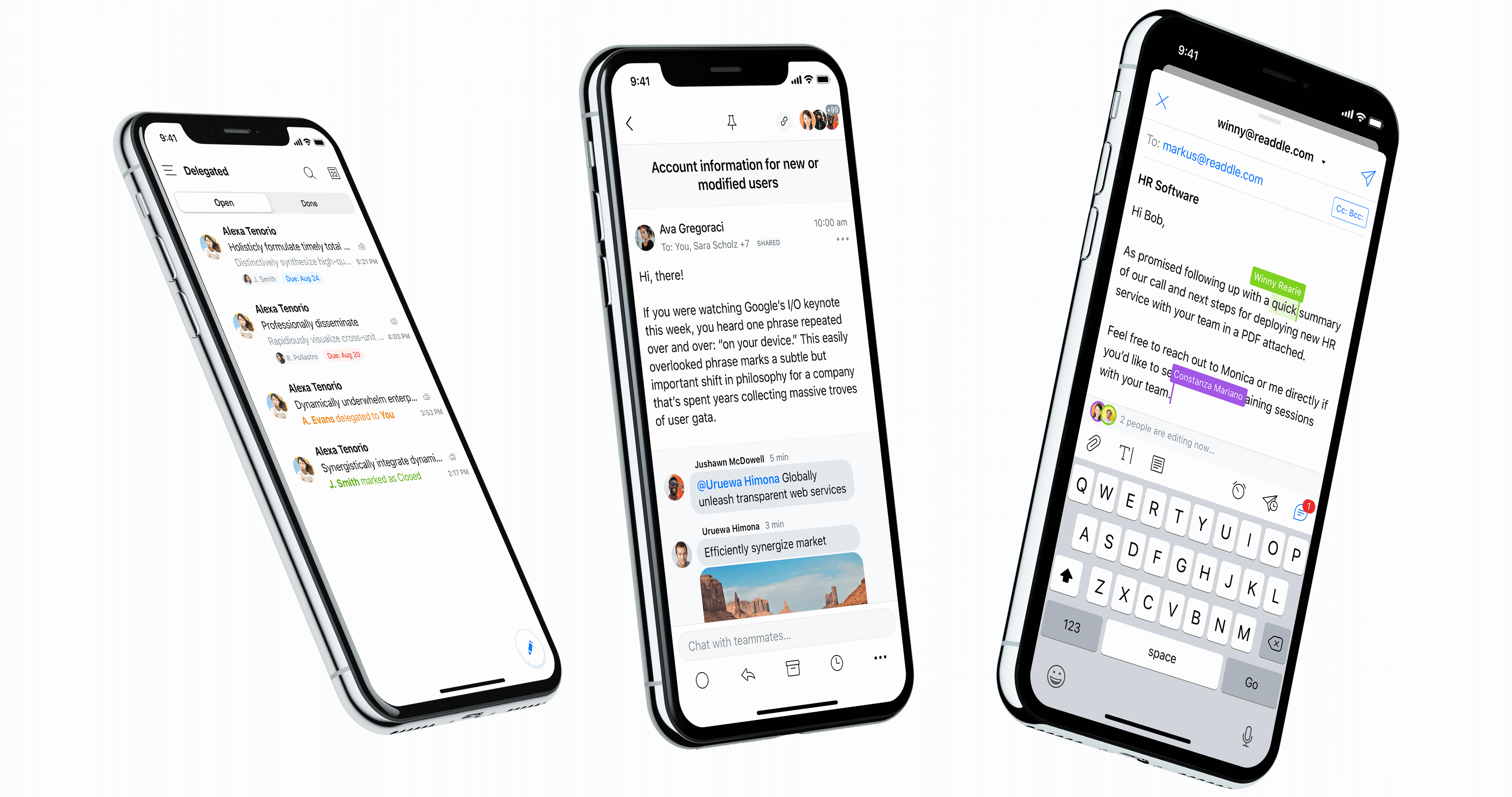
On the design front, Spark now uses simple headers to separate smart sections, such as newsletters, notifications and personal emails. It looks better than the rounded boxes with a colorful background.
There’s a lot of whitespace now, but the company has also taken advantage of this update to add dark mode. When you tap on a thread, the thread view has been updated as well.
When it comes to new features, the app tries to autopopulate your inbox with profile pictures. Just like Vignette, it pulls images from popular web services. For instance, if somebody who emails you has a Twitter account under the same email address, Spark can add the Twitter profile picture to your inbox.
Everybody has their own way of dealing with their email inbox. That’s why Spark lets you choose the buttons that appear at the bottom of an email thread. For instance, if you use folders a lot, you can put a folder button. But if you want to replace that button with a snooze button, you can.
Spark is now a better citizen on iPadOS 13. You can open multiple instances of Spark. This way, you can work on a document with an email thread using Split View and you can open a second Spark window to check your inbox in a separate workspace. Spark on iPadOS also supports the floating keyboard and new iPadOS gestures.


Xaira, an AI drug discovery startup, launches with a massive $1B, says it’s ‘ready’ to start developing drugs

Rabbit R1 hands-on review: Something is iffy about this

UK probes Amazon and Microsoft over AI partnerships with Mistral, Anthropic, and Inflection

‘Shōgun’ co-creators break down the finale: ‘It’s a story about death’

Tesla’s new growth plan is centered around mysterious cheaper models

Tesla’s in trouble. Is Elon Musk the problem?

Two widow founders launch DayNew, a social platform for people dealing with grief and trauma

Google Pixel 9 and Pixel 9 Pro: Release date, specs, new features, and other rumors

UnitedHealth says Change hackers stole health data on ‘substantial proportion of people in America’

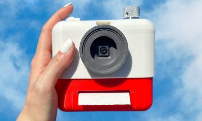
Mood.camera is an iOS app that feels like using a retro analog camera

API startup Noname Security nears $500M deal to sell itself to Akamai

US think tank Heritage Foundation hit by cyberattack

NASA discovered bacteria that wouldn’t die. Now it’s boosting sunscreen.

How to watch ‘Argylle’: When and where is it streaming?

Tesla drops prices, Meta confirms Llama 3 release, and Apple allows emulators in the App Store

Tesla layoffs hit high performers, some departments slashed, sources say

TechCrunch Mobility: Cruise robotaxis return and Ford’s BlueCruise comes under scrutiny

Meta to close Threads in Turkey to comply with injunction prohibiting data-sharing with Instagram

Former top SpaceX exec Tom Ochinero sets up new VC firm, filings reveal

Where’s the AI in these ‘AI-powered’ products for your home?
Xaira, an AI drug discovery startup, launches with a massive $1B, says it’s ‘ready’ to start developing drugs
Rabbit R1 hands-on review: Something is iffy about this
UK probes Amazon and Microsoft over AI partnerships with Mistral, Anthropic, and Inflection
‘Shōgun’ co-creators break down the finale: ‘It’s a story about death’
Tesla’s new growth plan is centered around mysterious cheaper models
Tesla’s in trouble. Is Elon Musk the problem?
Two widow founders launch DayNew, a social platform for people dealing with grief and trauma
Google Pixel 9 and Pixel 9 Pro: Release date, specs, new features, and other rumors
UnitedHealth says Change hackers stole health data on ‘substantial proportion of people in America’
Mood.camera is an iOS app that feels like using a retro analog camera
-

 Business6 days ago
Langdock raises $3M with General Catalyst to help businesses avoid vendor lock-in with LLMs
-

 Entertainment5 days ago
What Robert Durst did: Everything to know ahead of ‘The Jinx: Part 2’
-

 Entertainment5 days ago
This nova is on the verge of exploding. You could see it any day now.
-

 Business5 days ago
India’s election overshadowed by the rise of online misinformation
-
 Business4 days ago
This camera trades pictures for AI poetry
-

 Business5 days ago
CesiumAstro claims former exec spilled trade secrets to upstart competitor AnySignal
-

 Business7 days ago
Screen Skinz raises $1.5 million seed to create custom screen protectors
-

 Entertainment7 days ago
Dating culture has become selfish. How do we fix it?